
Ahhh, the DTM. Every APHG student I've had can share horror stories about it. Since the DTM is the first model we study in class, I've had an obsession with them analyzing it and its "model-worthiness." Every semester, we sort of fail miserable to gather the information, actually make meaning out of the information, and actually see that the DTM doesn't really accurately reflect a lot of countries in the world today.
So this year, we took a little different approach to the DTM. My students grabbed current crude birth and death rate stats for almost every major country and did their best to classify each country. What we got was this (for some reason the Google Sheet hates the DRC, Congo, and CAR, but suffice to say they'd be the same color as their surroundings):
So this year, we took a little different approach to the DTM. My students grabbed current crude birth and death rate stats for almost every major country and did their best to classify each country. What we got was this (for some reason the Google Sheet hates the DRC, Congo, and CAR, but suffice to say they'd be the same color as their surroundings):
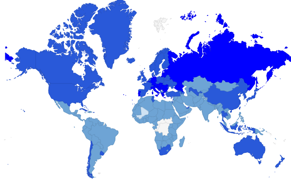
So the major problem with using "old" DTM stages is that we find almost no difference in countries at very different levels of development: Argentina (CBR 17, CDR 7) fits into the same stage of the DTM as Madagascar (CBR 34, CDR 7) in spite of the fact that Madagascar's natural increase is much, much higher than Argentina's, and there is no way that we'd view Argentina (GDP per capita $18,600, Labor force 72% services) and Madagascar (GDP per capita $1,000, Labor force 34.5% agriculture) as being similar economically.
The big "problem"? Crude death rate was far too low across the board to see any countries as being in Stage 2 of the DTM. Nearly everyone had a CDR near the end of Stage 3 (or early Stage 4) but the CBRs were all over the map. So after looking at this, plus other population statistics like infant mortality and life expectancy, we decided to expand the DTM to 7 stages, and change the way the curve was drawn regarding CDR.
The big "problem"? Crude death rate was far too low across the board to see any countries as being in Stage 2 of the DTM. Nearly everyone had a CDR near the end of Stage 3 (or early Stage 4) but the CBRs were all over the map. So after looking at this, plus other population statistics like infant mortality and life expectancy, we decided to expand the DTM to 7 stages, and change the way the curve was drawn regarding CDR.

So the main difference was that we dropped CDR drastically after the ever popular "Stage 1" that represents where societies were thousands of years ago. We decided to do a range for CBR and CDR to make it easier to classify countries, and we split up some stages so that we could see differences. Roughly speaking, Stage 2 is still by itself, and Stage 3 has now become 3 and 4, Stage 4 is now 5 and 6, and the hypothetical negative growth Stage 5 is Stage 7. The main requirement in Stage 7 is an actual natural decrease. This gets us a map like this (pretty sure we still didn't figure out how to name DRC and Congo):
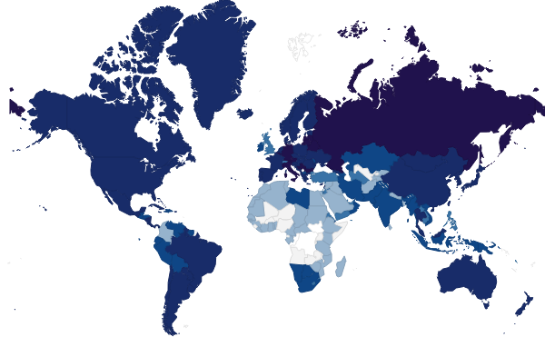
So now there is a definite variance between the periphery and the other parts of the world. We changed the shading a little so that there would hopefully be a clearer difference, but we're still playing with that (thanks though, Google Sheets). So is the new DTM perfect? Well, probably not, but what model is? It does show the parts of the world where huge population growth is still happening, as opposed the places where it has slowed down, even within Africa itself (see Libya and Southern Africa). Hopefully this new DTM is slightly less traumatic, and we have a better understanding of the flaws of any model, but especially the DTM.
 RSS Feed
